Layout
<ahi-layout> | AhiLayout
Layout is used to create the main layout of an app.
<!-- Inspect the templates/layout/index.html file to see the actual source code for this example -->
<iframe
  loading="lazy"
  style="visibility:hidden;min-height:550px;" onload="this.style.visibility='visible';"
  sandbox="allow-forms allow-modals allow-popups allow-presentation allow-same-origin allow-scripts"
  title="Layout template demo"
  src="../../templates/layout/">
</iframe>
Navigation on a narrow screen
Below 768px the navigation is a drawer over the page. Once the toggle or nav-open has opened
it, a click on a nav item without a subnav closes it again, because the reader has picked a destination. It
stays open when the link opens somewhere else and leaves this page where it is, which happens in two ways:
-
The nav item’s
targetloads the link somewhere else._blankopens a new tab, and a name opens or reuses the window or frame of that name._self,_parentand_topload in place of this page, so they close the drawer like a link with notarget. - Ctrl, Cmd or Shift is held. Ctrl-click, or Cmd-click on macOS, opens a link in a new tab, and Shift-click opens one in a new window in most browsers.
A nav item with no href and no subnav renders a button, which opens nothing elsewhere, so a
click on it closes the drawer whatever keys are held. A middle-click fires auxclick rather than
click, so it leaves the drawer open. On a wide screen a click on a nav item never closes the
navigation.
The drawer also stays open when a listener on the nav item, or on the navigation around it, prevents the
click’s default action, since that listener runs before the layout sees the click. If it does so to route
within the app, the reader does move to a new view, so close the drawer yourself: set the layout’s
navOpen to false while its isNarrow is true. On a wide
screen that would collapse the navigation instead. Closing it this way does not move focus, so also move
focus to the new view in the main content. Moving focus there also hides a drawer that keyboard focus
brought into view, described below. Setting navOpen does nothing for that drawer, since it is
already false.
Moving keyboard focus into the closed navigation brings the drawer into view without opening it. A click on a nav item, or Enter on one, hides it by the same rules as the opened drawer: a same-tab link hides it, and a link that opens somewhere else leaves it in view. It also hides once focus or a click moves to the main content. On a narrow screen the pointer does not bring the drawer into view, so moving it out of the drawer does not hide it either.
Escape closes the opened drawer, and so does a click that starts and ends outside it. Escape does nothing to a drawer that keyboard focus brought into view, since that drawer was never opened.
When a click on a nav item hides either drawer while keyboard focus is in it, focus moves to the navigation
toggle, so it is not left on an item that is now off-screen. Escape, or a click outside, does the same when
it closes the opened drawer. The page does not scroll to the toggle. A click outside usually moves focus
itself first, and focus then stays where the click put it. A toggle of your own in the
nav-toggle slot takes focus the same way. If nothing in that slot is in the tab order, focus is
dropped instead. Where the next Tab goes then depends on the browser, and in some it lands on a nav item and
brings the drawer back. A fragment link, or a client-side router that moves focus to the new view, still
moves it there, since it runs after the click.
Navigation rail
On a wide screen the navigation is either opened at its full width or hidden off-screen, and the hidden state returns on hover through a brief “peek”. A touch tablet has no hover, so peek is unreachable there: the navigation is either 250px of a 834px screen or two taps away behind the toggle.
An open <ahi-dropdown> slotted into the navigation holds a peek in view: the pointer
leaving does not hide it while the dropdown is open, and it hides shortly after the dropdown closes instead,
unless focus has moved within the navigation since the pointer left. A dropdown inside another component’s
shadow root does not hold it. A dropdown whose slot is changed so that it leaves the navigation
while open gives the navigation no sign of it, so the peek then waits for focus or a click in the main
content, or for the pointer to cross it again.
Add nav-rail and the collapsed state becomes a narrow icon-only rail instead of nothing. Every
top-level item stays visible and one tap away, and the content column keeps most of the width it would have
gained by hiding the navigation altogether.
<ahi-layout nav-rail persist-nav-state>
  <ahi-navigation slot="nav">
    <ahi-nav-item icon="home" href="/">Home</ahi-nav-item>
    <ahi-nav-item icon="calendar" href="/schedule">Schedule</ahi-nav-item>
  </ahi-navigation>
  <div>Main content</div>
</ahi-layout>
nav-rail is a preference, not a state. nav-open still says whether the navigation
is expanded; nav-rail says what the collapsed form looks like. That is why toggling out of the
expanded state returns to the rail rather than to nothing, and why persist-nav-state needs no
extra key — the nav-open value it already stores restores the right one of the two.
Some consequences worth knowing:
-
It applies to wide screens only. Below 768px the navigation is a drawer, and there is no
room for a rail beside it.
nav-railis ignored there. - A railed layout starts collapsed. The rail is already on screen, so starting collapsed costs the reader nothing and keeps the content column at full width, which is the point of asking for one.
- Peek does not apply. There is nothing hidden to reveal, so hover and focus leave the rail alone.
- The navigation is not resizable while railed. The rail is a fixed width, so the resize handle is hidden the same way it is on a narrow screen.
-
The toggle moves into the top of the rail. It is what expands the rail back to its
labels, so it is placed as the rail’s first item rather than left floating over the content. That is the
same position
ahi-navigationrenders itsheaderslot in — a logo there and the toggle will sit on top of each other, so hide the header while railed if you use one.
Choosing when to use it
nav-rail is deliberately consumer-selected rather than a width AKU picks for you. Whether a
rail beats a hidden navigation depends on how many top-level destinations an app has and how wide its
content needs to be — questions the component cannot answer. Set the attribute from whatever breakpoint
policy your app already has.
Sizing
The rail is one interactive target plus the padding around it:
--layout-nav-rail-width: calc(var(--ahi-target-min-size) + var(--ahi-space-4) * 2 + var(--ahi-space-2) * 2);
Because --ahi-target-min-size follows the pointer rather than the viewport, a touch device gets
a rail sized for a thumb and a mouse-driven desktop gets a more compact one, without either being inferred
from screen width. Override --layout-nav-rail-width if you need a different figure.
Telling slotted navigation to render icon-only
While railed, the layout sets --ahi-nav-rail: 1 on its navigation region.
Nav Item reads it and drops its
label, keeping the icon. The signal is a custom property rather than an attribute because it inherits
through the flat tree — down into the slotted <ahi-navigation> and on into each
<ahi-nav-item>’s own shadow root — which no attribute selector can do across two shadow
boundaries.
Custom navigation content can read the same property:
.my-nav-label {
  display: block;
}

/* 1 while the layout is railed, otherwise unset. */
@container style(--ahi-nav-rail: 1) {
  .my-nav-label {
    display: none;
  }
}
Give any item you want to survive the rail an icon; an item with no icon has nothing left to
show once its label is dropped.
Theming
Accent color
AKU provides a concept called accent color that supports both light and dark themes. To get
started with using accent color, first remove all themes from the <head> section of the
application and only leave the default light theme that we’ll use as a basis:
<link rel="stylesheet" href="/node_modules/@azaleahealth/azalea-kit-ui/dist/themes/light.css" />
The theme ships defaults for these — --ahi-color-blue-600 for the accent and white on top of it
— so a plain install already paints correctly and you can skip this section entirely.
To use your own brand color instead, add the following after the light theme, replacing
accent-color with a hex value and text-on-accent-color with one that offers the
necessary 4.5:1 contrast ratio against it:
<style>
  :root {
    --ahi-color-accent: accent-color;
    --ahi-color-text-on-accent: text-on-accent-color;
  }
</style>
Top bar color
For applications that utilize the
Top Bar component, AKU provides
slightly more control over the visual appearance. For this purpose, we have a CSS Custom Property named
var(--ahi-color-accent-secondary), which defaults to --ahi-color-blue-700 — the
darker step, because this is the surface that carries body-sized white text, where it measures 7.58:1. It
can be overridden to customize the background color of the top bar and navigation header:
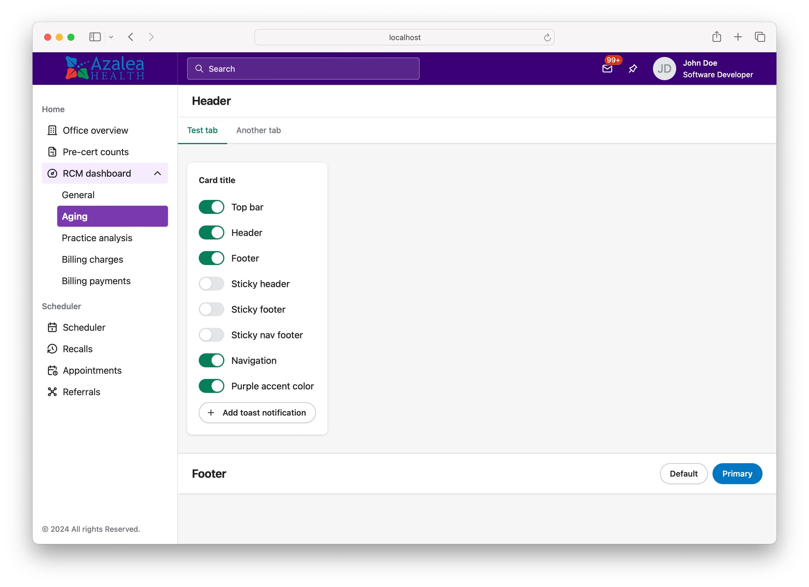
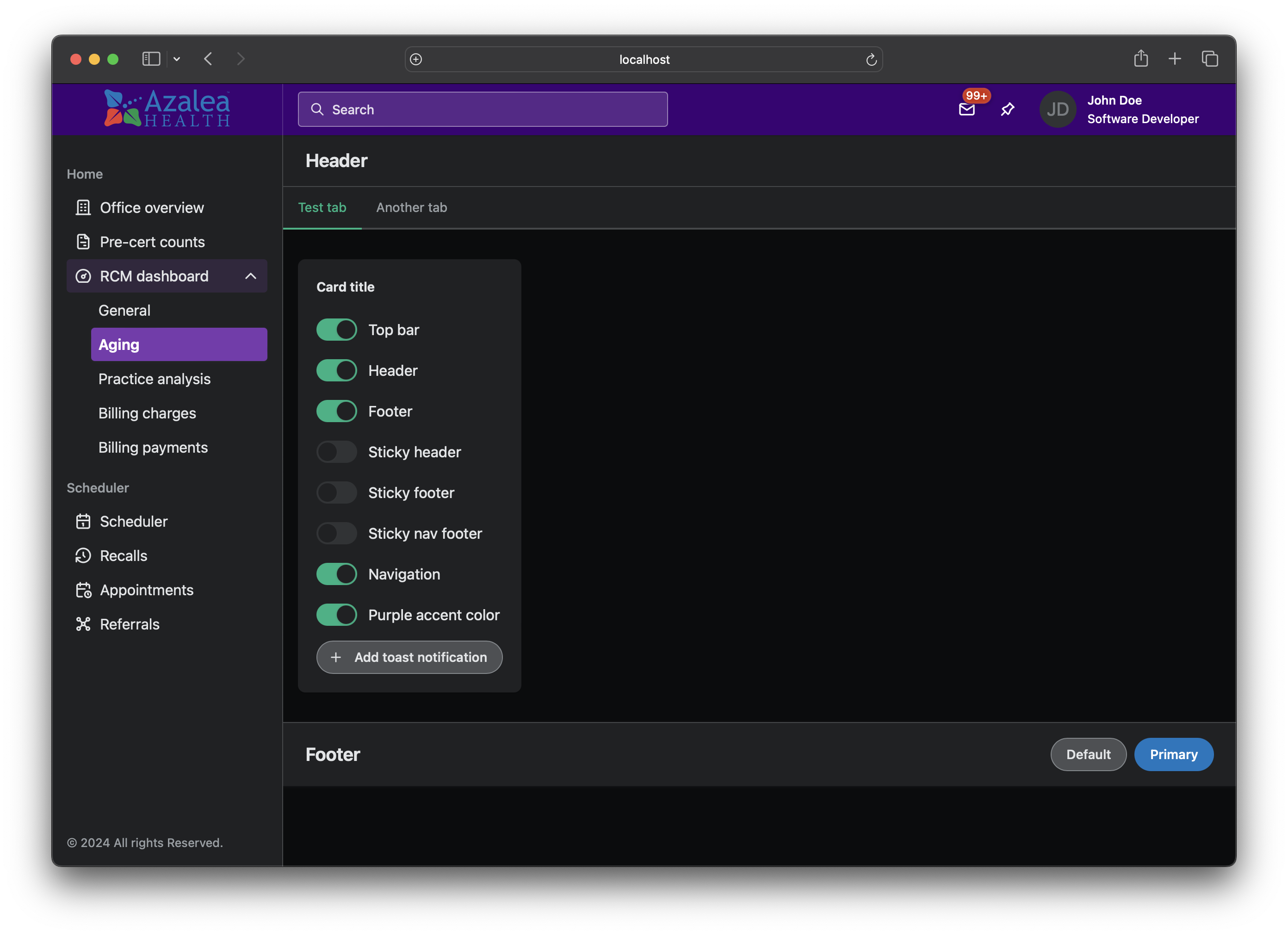
To get started using this feature, add the following styles and replace color with a custom hex
value that offers at least 4.5:1 contrast ratio against white text:
<style>
  :root {
    --ahi-color-accent-secondary: color;
  }
</style>
Note that the text and interface elements inside the top bar and navigation header use white text by
default. Although we do not recommend changing this, you can customize this color by using the
--ahi-color-text-on-accent-secondary token.
Best practices
-
Layout uses the
<main>element internally which is an HTML sectioning element and defines an ARIA landmark role. For that reason, you should never put the layout component inside another HTML landmark.
Related components
- To visually group content in a layout section, use the Card component.
- To layout a set of smaller components, use the Stack component.
Importing
To import this component using a script tag:
<script type="module" src="/path/to/azalea-kit-ui/dist/components/layout/layout.js"></script>To import this component using a bundler:
import '@azaleahealth/azalea-kit-ui/dist/components/layout/layout.js';Slots
| Name | Description |
|---|---|
| (default) | The default main section content. |
nav
|
Used to place content inside the navigation sidebar. |
top-bar
|
Used to place the Top Bar component. |
header
|
Used to place content inside the header section. This slot can be made sticky by utilizing the
sticky property.
|
footer
|
Used to place content inside the footer section. This slot can be made sticky by utilizing the
stickyFooter property.
|
nav-toggle
|
Used to place a custom nav-toggle component, for cases where you might need to add a tooltip. |
Learn more about using slots.
Properties
| Name | Description | Type | Default | |
|---|---|---|---|---|
navOpen
nav-open
|
Controls whether the navigation is hidden off-screen or not. Defaults to true for wide
viewports, and false otherwise.
|
boolean
|
- | |
persistNavState
persist-nav-state
|
Controls whether the navigation’s open/closed state is persisted across page loads. This is useful for multi-page apps, where clicks on links trigger a full page load. |
boolean
|
false
|
|
syncNavState
sync-nav-state
|
Controls whether the navigation’s open/closed state and width is synced across tabs/windows on the same origin. This is useful for long-lived app sessions where you may have multiple tabs/windows open at once. |
boolean
|
false
|
|
navRail
nav-rail
|
Controls whether a wide-screen navigation that is not opened stays on screen as a narrow icon-only
rail, rather than hiding off-screen behind the toggle. This is a preference, not a state:
nav-open still says whether the nav is expanded, and this says what the collapsed form
looks like. That is what makes toggling out of opened return to the rail rather than to
nothing, and it is why persist-nav-state needs no new key — the persisted
nav-open already restores the right one of the two. Off by default, so a consumer that
does not opt in renders exactly as before. Only wide screens are affected; below 768px the nav is a
drawer and there is no room for a rail.
|
boolean
|
false
|
|
padding
|
Controls the padding of the default main section slot. When set to “none”, the nav and header slots will still have padding. |
'm' | 'none'
|
'm'
|
|
sticky
|
Controls whether the layout’s header has sticky positioning. |
boolean
|
false
|
|
stickyFooter
sticky-footer
|
Controls whether the layout’s footer has sticky positioning. |
boolean
|
false
|
|
isNarrow
|
A getter whose values reflects whether the layout component considers the viewport to be narrow or not. A narrow viewport is considered to be less than 768px wide. |
boolean
|
- | |
updateComplete |
A read-only promise that resolves when the component has finished updating. |
Learn more about properties and attributes.
Dependencies
This component automatically imports the following dependencies.
<ahi-button><ahi-icon><ahi-nav-toggle><ahi-spinner>